Page 1 of 2
New band shirt design - feedback wanted
Posted: Mon Mar 11, 2013 5:30 pm
by K-Bizzle
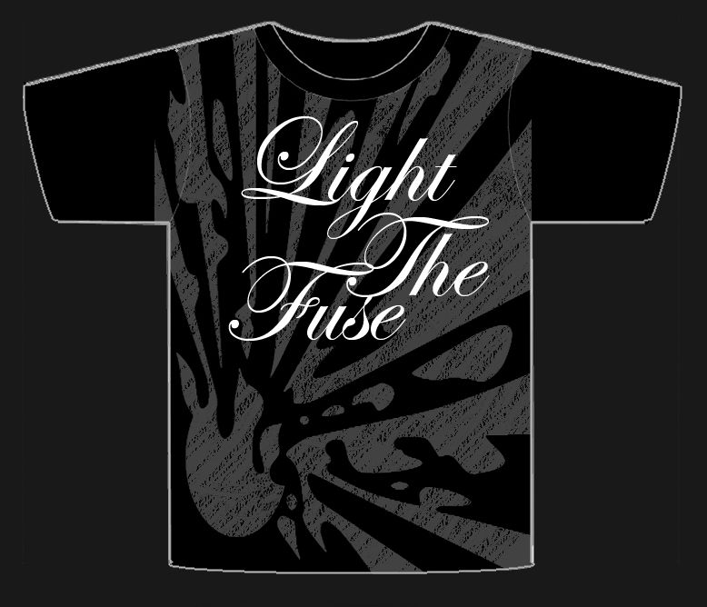
New band is called Light the Fuse.
Partial back story here I've always wanted to use some hazard type logos before and for this band the explosive risk symbol is pretty fitting.
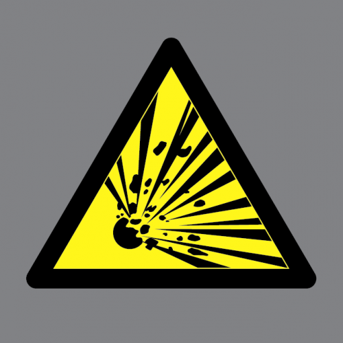
Anyway heres what I put together from the idea in my head.
Still needs tweaking obviously but I just wanted some outside thoughts and opinions before continuing on.
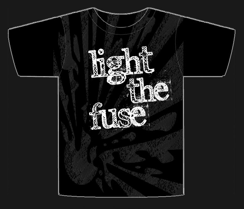
EDIT
First tweak as per a request from a band member.
Re: New band shirt design - feedback wanted
Posted: Mon Mar 11, 2013 5:42 pm
by TyroneBiggums
I like the first one, the second one looks a little too Hot Topic-y with the big white cursive lettering over a black background. Just my opinion.
Re: New band shirt design - feedback wanted
Posted: Mon Mar 11, 2013 5:51 pm
by K-Bizzle
TyroneBiggums wrote:I like the first one, the second one looks a little too Hot Topic-y with the big white cursive lettering over a black background. Just my opinion.
Yeah feel ya on that.
Assuming you hadn't seen the two to compare any just general comments on the design overall?
I like it but thats partially because its my idea haha.
Re: New band shirt design - feedback wanted
Posted: Mon Mar 11, 2013 5:56 pm
by Rampage
I'm going to say something and while you may think I am joking, I'm not: Before I started losing weight, I would never buy a shirt with that first logo going across the chest because I would think that it would accentuate a flabby chest. That kept me from buying a ton of shirts for a long time.

As for the other t-shirt design, I like the first one you put up (with the design extending onto the sleeve). The only knock that I have is that the script kind of writing looks a little generic and feels like it is there on top of the design and doesn't feel like it is part of it.
Sorry if I came off like a dick, I am really drunk right now.
Re: New band shirt design - feedback wanted
Posted: Mon Mar 11, 2013 6:00 pm
by TyroneBiggums
K-Bizzle wrote:TyroneBiggums wrote:I like the first one, the second one looks a little too Hot Topic-y with the big white cursive lettering over a black background. Just my opinion.
Yeah feel ya on that.
Assuming you hadn't seen the two to compare any just general comments on the design overall?
I like it but thats partially because its my idea haha.
I'm no design artist, but if you're going to run with that second design I would try and darken the gray background a little bit. It seems like it's too close to the white letters in color.
Re: New band shirt design - feedback wanted
Posted: Mon Mar 11, 2013 6:12 pm
by K-Bizzle
Rampage wrote:I'm going to say something and while you may think I am joking, I'm not: Before I started losing weight, I would never buy a shirt with that first logo going across the chest because I would think that it would accentuate a flabby chest. That kept me from buying a ton of shirts for a long time.
As for the other t-shirt design, I like the first one you put up (with the design extending onto the sleeve). The only knock that I have is that the script kind of writing looks a little generic and feels like it is there on top of the design and doesn't feel like it is part of it.
Sorry if I came off like a dick, I am really drunk right now.
Did not come off as a dick.
Good to know haha.
The script is super generic I know but I haven't found a script I like as much as Edwardian so I'm not sure how to fix that quite yet.
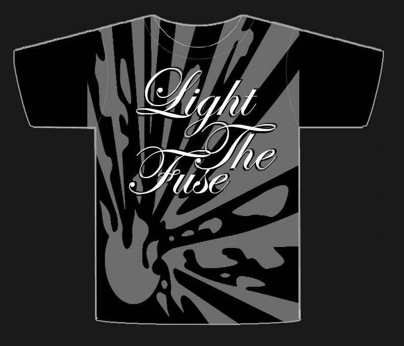
Also darkened the grey as suggested.
I agree that it sorta sits on top of it, does this improve that to you?
Re: New band shirt design - feedback wanted
Posted: Mon Mar 11, 2013 6:26 pm
by TyroneBiggums
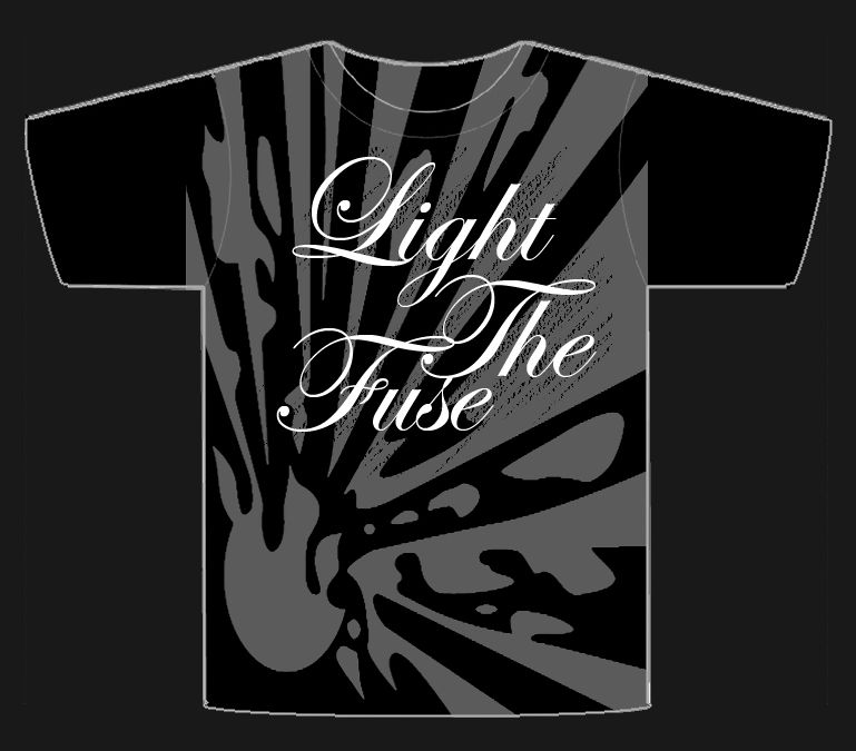
I like it more now, but I would add that effect to the whole shirt
Re: New band shirt design - feedback wanted
Posted: Mon Mar 11, 2013 7:12 pm
by K-Bizzle
Not bad actually.
Kinda digging it, thanks for the input guys very helpful.
Re: New band shirt design - feedback wanted
Posted: Tue Mar 12, 2013 9:36 am
by metalguy
Hazard one looks pretty cool. Yellow works well with the gray background.
and if I'm completely honest, don't really like the second one at all. Something about it just says that even if it were given to me for free, I wouldn't wear it.

Reasoning: 60% font 30% splatter background 10% they definitely don't work together. Please don't ban me

Re: New band shirt design - feedback wanted
Posted: Tue Mar 12, 2013 9:47 am
by phrophus
Honestly, it's too busy for me. I like the hazard logo deal, but I'd incorporate that in some other way, probably a bit more subtle. I'm not a fan of shirts that basically have designs that cover the entire shirt. Like affliction type shirts and whatnot. (not comparing your design to affliction...pretty sure you'd bant me for that).
Re: New band shirt design - feedback wanted
Posted: Tue Mar 12, 2013 9:53 am
by izzy
The "unleash the fury" type graphic is ok but the font is completely inappropriate. Finding an edgy font (say at dafont.com) would go far to improving the entire feel of the imagery. Id try some fonts out for you brother but im absolutely swamped. Best of luck.
Re: New band shirt design - feedback wanted
Posted: Tue Mar 12, 2013 10:12 am
by K-Bizzle
Hmmm I've heard the same sort of comments from a few folks (both here and elsewhere).
Also found out a screen that big is extra $ usually.
I personally really like graphics that fill an entire shirt though.
Maybe I try a version with no text at all on the front then move the text to the back top?
Again thanks for the input guys. No grudges held or negativity at all from me for the criticisms. That's why I posted this was to get that kind of feedback. This was one of those things I worked and reworked for awhile and have sort of lost perspective on it, which is why I asked for input.
Re: New band shirt design - feedback wanted
Posted: Tue Mar 12, 2013 6:43 pm
by Filter500
izzy wrote:The "unleash the fury" type graphic is ok but the font is completely inappropriate. Finding an edgy font (say at dafont.com) would go far to improving the entire feel of the imagery. Id try some fonts out for you brother but im absolutely swamped. Best of luck.
I was going to post the same thing.
Re: New band shirt design - feedback wanted
Posted: Tue Mar 12, 2013 7:35 pm
by K-Bizzle
Closer?
Re: New band shirt design - feedback wanted
Posted: Tue Mar 12, 2013 8:02 pm
by Filter500
K-Bizzle wrote:Closer?
Yup. I would try some other fonts as well, but that is a contender and a step in the right direction. I would scale the text down just a little bit, too.
Re: New band shirt design - feedback wanted
Posted: Tue Mar 12, 2013 8:04 pm
by K-Bizzle
Yeah played with angles a bit and preferred all lower case in this font.
Downloaded a bunch of fonts in this similar style, gonna mess with em later but this one caught my eye first.
Font aside overall design is pretty good now I think though, yes?
Re: New band shirt design - feedback wanted
Posted: Tue Mar 12, 2013 8:05 pm
by ovid9
I like the font better than the first one.
I, personally, am not a fan of fully shirt graphics. I tend to like centered graphics, even if its very large. That's just my personal preference.
So, with that in mind, I think its pretty cool looking.
Re: New band shirt design - feedback wanted
Posted: Tue Mar 12, 2013 8:15 pm
by K-Bizzle
ovid9 wrote:I like the font better than the first one.
I, personally, am not a fan of fully shirt graphics. I tend to like centered graphics, even if its very large. That's just my personal preference.
So, with that in mind, I think its pretty cool looking.
Man I keep hearing this.
Am I that outta touch with my overly tight fully graphiced bro shirts?
Re: New band shirt design - feedback wanted
Posted: Tue Mar 12, 2013 8:17 pm
by ovid9
K-Bizzle wrote:
Man I keep hearing this.
Am I that outta touch with my overly tight fully graphiced bro shirts?
No, I think HCAF is skewed HEAVILY towards the non-fully graphic'd bro shirt crowd.

There seems to be lots of people who love those things.
Re: New band shirt design - feedback wanted
Posted: Tue Mar 12, 2013 8:22 pm
by K-Bizzle
ovid9 wrote:K-Bizzle wrote:
Man I keep hearing this.
Am I that outta touch with my overly tight fully graphiced bro shirts?
No, I think HCAF is skewed HEAVILY towards the non-fully graphic'd bro shirt crowd.
There seems to be lots of people who love those things.
Maybe so but I'm also getting this from others outside of HCAF.
FYI dude the final design will also end up being screen printed onto 4x12 grill clothes.
Re: New band shirt design - feedback wanted
Posted: Tue Mar 12, 2013 8:30 pm
by ovid9
K-Bizzle wrote:Maybe so but I'm also getting this from others outside of HCAF.
FYI dude the final design will also end up being screen printed onto 4x12 grill clothes.
Maybe the bro-shirt phase is passing? Hmmmmm.....
I think that could make a cool 4x12 screen.
How do you feel about copyright infringement and 8-bit video games? Mouser from Super Mario Bros 2 with a lit bomb....can't go wrong!

*NES geek*
(Not a real suggestion)
Re: New band shirt design - feedback wanted
Posted: Tue Mar 12, 2013 8:54 pm
by K-Bizzle
ovid9 wrote:Maybe the bro-shirt phase is passing? Hmmmmm.....
I think that could make a cool 4x12 screen.
How do you feel about copyright infringement and 8-bit video games? Mouser from Super Mario Bros 2 with a lit bomb....can't go wrong!
*NES geek*
(Not a real suggestion)
HAHAHA Hilarious dude.
The guys in my band have been pushing the idea of doing something with Mouser since the beginning haha.
Re: New band shirt design - feedback wanted
Posted: Tue Mar 12, 2013 8:59 pm
by ovid9
K-Bizzle wrote:HAHAHA Hilarious dude.
The guys in my band have been pushing the idea of doing something with Mouser since the beginning haha.
The guys in your band are obviously awesome.

Re: New band shirt design - feedback wanted
Posted: Wed Mar 13, 2013 12:09 am
by Lloyd Blankfein
I can't even make out what that exploding logo is on your shirt- looks like someone got hit with a grey tomato.
Stay away from script type stuff. It's very "atreyu," or that crowd anyways.
Perhaps try some sort of military grade font perhaps even a crylic equivelant like something your see on ordinance from the Soviet era. Fwiw, grey and red to great together. A distressed red font in Soviet style over a more focused (ie: people know what it is) explosion logo would be best IMO.
If you're worried about color costs- dont be. I just went through this and ordered thousand upon thousands of labels for my business and when I threw that color fear ($$$ to burn another plate) I was much happier with my label.
Re: New band shirt design - feedback wanted
Posted: Wed Mar 13, 2013 12:17 am
by Lloyd Blankfein
Like the lettering on this:
http://designtaneous.com/2011/03/soviet-propaganda/Even has similar strokes as to yours, perhaps you could draw inspiration from it. You're in a punk band right? Anti-authority, all that stuff. Soviet lettering would work well.